.png)

Encouraging Student Connection Through Familiar Meetups
Incorporating a buddy system feature into the Eat Together app focusing on familiarity and comfortability when meeting new people on school campuses.
Context
Eat Together is a student-run community app that helps students connect through on-campus meetups. As part of Cohort 0, my team and I created a buddy system, a feature that allows users to select one buddy through the app and bring them along to future hosted meetups—supporting students who feel more comfortable attending events with someone they know.
Duration
5 months
Roles
Lead Product Designer, UX/UI Designer & Prototyper, UX Researcher
Team
3 UX/UI & 3 developers
Tools
Figma, FigJam, Canva
PROBLEM
"How might we shape in-person meetups to better support comfortable, community-building interactions among new peers?"
While Eat Together helps students discover meetups and connect with new peers, the experience of attending events alone can feel uncomfortable or intimidating. This social barrier prevents students from taking the next step, from discovering events to actually showing up.
SOLUTION
Implementing a buddy-selection feature helping ease social discomfort and encourage participation.
My team and I designed an additional feature to the app. This feature enables users to choose a specific buddy within the app and bring them to hosted meetups, creating a more comfortable and familiar social experience. By lowering the emotional barrier of attending alone, the system helps students feel more confident and motivated to engage with their campus community.
USER INTERVIEWS
Let's talk to those who use Eat Together.
To understand how people were using Eat Together and where the experience could be strengthened, my team and I conducted semi-structured interviews with 6 active users. We gathered insights on their motivations, expectations, and challenges when connecting through the app. Our participants included several students as well as the president and creator of Eat Together, whose perspective helped contextualize user needs within the app’s mission and goals.
Some of the questions we asked them:
Some of the questions we asked them:
- How do you usually feel meeting new people in person?
- Can you walk me through your experience using Eat Together and attending meetups?
- What would make you more likely to attend a meetup in the future?
FINDINGS
What we learned about their perspectives.
Analyzing feedback across participants allowed us to surface several meaningful insights that shaped our design direction:
- Motivated to build new connections. Users initially joined Eat Together to expand their social circles and meet new people on campus.
- Discomfort meeting strangers in person. Although students valued the opportunity to connect, many expressed hesitation and anxiety when attending meetups with unfamiliar peers.
- Desire for familiarity and support. Users shared that they would feel more comfortable attending events if they could attend with someone they already know.
Our interviews revealed a clear opportunity: students wanted a more comfortable way to attend meetups, ideally with a companion. To define how this buddy experience should function within the app, we ran a follow-up survey.
SURVEYS
Defining user preferences for feature integration.
Building on the insights gathered from user interviews, we conducted a follow-up survey to better understand how a buddy feature should be integrated into the existing Eat Together experience.
Some questions we asked and their insights:
Some questions we asked and their insights:
How do you prefer to search for a buddy?
Survey responses showed that users preferred selecting a buddy from their existing friends (4 participants), followed by browsing recommendations (2 participants).
Where in the app do you think it would be most convenient to select a buddy?
Survey responses showed that users most often preferred the process of selecting a buddy would be through their profile (5 participants).
Where within the app would you expect to view your selected buddy?
Survey responses showed that users most expected to see their selected buddy through their profile (6 participants).
DESIGN REQUIREMENTS
Translating insights into design requirements
Drawing from our user research, we established a set of design goals that would shape how the buddy system should function within the app.
- Promote comfort through familiarity by enabling users to find buddies who share similar interests or backgrounds.
- Ensure the buddy-selection feature is easily discoverable and simple to navigate.
- Integrate the buddy experience seamlessly into Eat Together’s existing user flow and visual identity.
LO-FI PROTOTYPE
The initial design based on user needs.
Guided by our research findings, we created low-fidelity wireframes to map out how users would search for, select, and manage a buddy within the app. This early prototype helped us visualize the experience and confirm that the feature aligned with identified user needs.
Here are some of interfaces we designed outside of the existing pages:
Here are some of interfaces we designed outside of the existing pages:
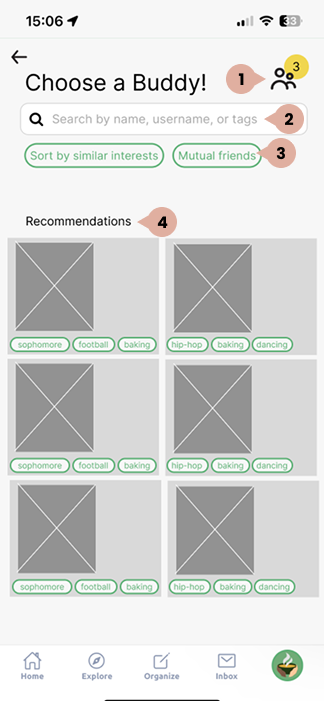
Providing users with several options to find a buddy streamlines their decision-making and makes it easier to find a suitable match.
1
Requests Page: Access page to view incoming and outgoing buddy requests
2
Search: Look up potential buddies by searching by name, username, or filter tags
3
Filter: Sort profiles based on shared interests or mutual friends
4
Recommednations: Default selections based on user similarities
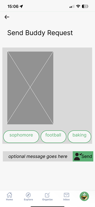
When sending a buddy request, sending an optional message enables users to personalize their outreach and form a stronger initial connection.
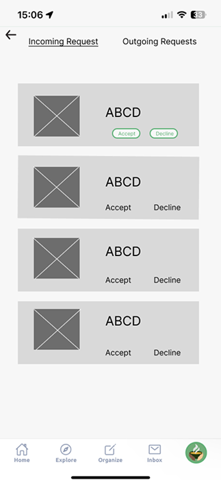
Viewing and managing incoming and outgoing requests allows users to stay organized and in control of their connections.
HI-FI PROTOTYPE
Polishing structure and visual details.
After validating the core flow with lo-fi wireframes, we moved directly into high-fidelity designs because the interaction model was straightforward and time was limited. This allowed us to focus on refining clarity, visual hierarchy, and brand alignment.
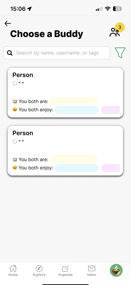

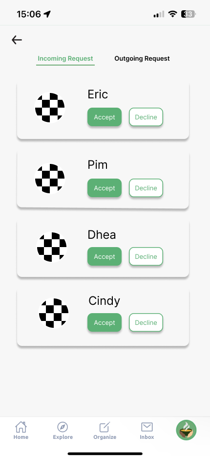
Buddy Selection, Buddy Message Request, and Requests refined pages
USER TESTING
Validating the design with users.
We tested our high-fidelity prototype with 3 participants to assess whether our design choices supported a smooth user experience. To capture a range of perspectives, we included 1 active Eat Together user and 2 participants unfamiliar with the app.
Our usability test consisted of task-based evaluation, where participants were asked to navigate the buddy feature and complete specific actions. After each task, we asked follow-up questions to uncover pain points and thought processes, while timing task completion to gauge efficiency. Here are some of the tasks we gave them:
Our usability test consisted of task-based evaluation, where participants were asked to navigate the buddy feature and complete specific actions. After each task, we asked follow-up questions to uncover pain points and thought processes, while timing task completion to gauge efficiency. Here are some of the tasks we gave them:
- Find the “Buddy" feature through the profile page
- Send a buddy request without a message attached
- Navigate to the Requests page and either accept or decline a buddy from the incoming requests tab
FINDINGS
Key observations and takeaways.
Usability testing revealed how effectively users could navigate the buddy feature and complete key tasks. While participants generally understood the overall flow, their feedback pointed to specific areas where clarity, visibility, and task efficiency could be improved. These findings guided our next iteration of the design:
- Positive review of the interface designs. Participants noted that it felt intuitive and simple to move through.
- Newly integrated components were difficult to spot within the existing interface. This reduced visibility led to slower task completion as participants needed more time to locate relevant actions.
- Participants felt the text lacked emotion and appeared flat. Adding expressive punctuation or tone was suggested to make the messaging feel more welcoming.
The insights gathered from usability testing guided final refinements to the buddy system, helping us refine usability, make key elements easier to find, and create a smoother experience. With these adjustments in place, we moved forward in finalizing the design and preparing the complete deliverable.
Landing page header of virtual ceremony portal
FINAL DELIVERABLE

Eat Together is a student-run platform that brings students together through on-campus meetups. Users can host or join events to meet new people, and a built-in buddy feature enables them to choose a companion, helping create a sense of familiarity and making the experience more approachable.
.png)
Find a Buddy Through Profile
Navigate the buddy system via their Eat Together profile.
Browse to Find a Buddy
A tailored recommendation list that surfaces potential buddies with shared interests or mutual connections.
.png)
.png)
Send a Personalized Buddy Request
Introduce and invite recommended peer to be buddy through a simple message request
Manage Buddy Requests
Review buddy requests sent and receieved
.png)
.png)
Track Buddy Requests and Status Changes
Track buddy activity to stay up to date.
REFLECTION
Key learnings and growth.
Engaging with a real user population. This was my first project involving direct engagement with real users of an app, giving me practical experience conducting interviews and collecting firsthand insights. Interacting with students who actively used the product enabled me to ground design decisions in real behaviors rather than assumptions, resulting in solutions that were more meaningful and user-aligned.
Leadership. Collaborating with early-stage UI/UX designers positioned me to step into a lead role. I facilitated team communication, structured timelines, and helped define priorities to keep the project on track. This strengthened my ability to manage workflows, support decision-making, and ensure alignment across disciplines, contributing to smoother coordination and steady progress throughout the development of the buddy-system feature.
Supporting early-stage UI/UX designers. Though still developing as a designer myself, I took initiative to mentor teammates who were new to UI/UX. I led Figma workshops, provided feedback, and helped establish shared best practices, which improved consistency and strengthened collaboration in the design process. These efforts helped elevate our team’s output and ensured we delivered a cohesive final experience.
.png)