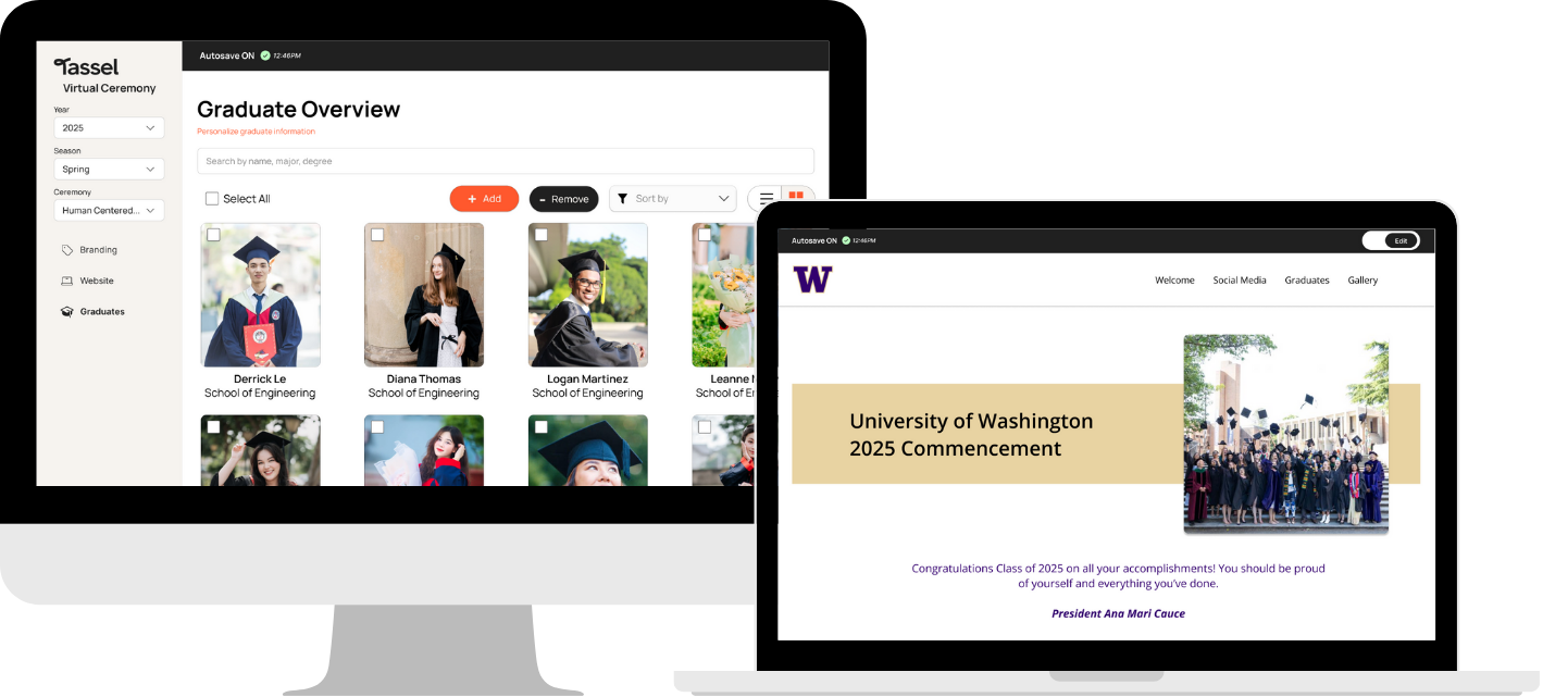

Enhancing Graduation Through A Virtual Experience
Reinventing the virtual ceremony portal into a more streamlined experience for both staff and their clients
Context
During the final quarters of my undergraduate degree, my teammates and I worked with Tassel, an all-in-one platform that works with schools to provide a smooth experience leading up to the graduation commencement. Undergoing a recent rebranding, Tassel has tasked us with recreating and improving the usability of the internal web page for their virtual ceremony feature: an add-on that celebrates graduating students using a digital memo.
Duration
6 months
My role
Product Designer, UI Designer & Prototyper, UX Researcher, Project Manager
Team
4 HCDE students
Tools
Figma, FigJam, Google Excel
PROBLEM
“How might we enhance the graduation experience by designing a digital platform that enables Tassel staff and clientele to efficiently host virtual ceremonies aligned with client needs?"
The virtual ceremony portal serves as the primary space where Tassel staff and their clients collaborate to build customized web pages that replicates the graduation ceremony experience online. Despite its importance, the platform’s interface has not kept pace with Tassel’s evolving brand direction. Clients reported challenges navigating the portal, and its appearance lacked consistency with other Tassel platforms. A comprehensive redesign was needed to modernize its visual identity, ensure a more intuitive workflow, and better support clients in efficiently hosting virtual ceremonies.
SOLUTION
A redesign of the virtual ceremony portal web page offering a streamlined experience.
We redesigned the virtual ceremony portal to reflect Tassel’s refreshed brand identity and to offer a more streamlined, user-friendly experience. Through reorganized content, clearer terminology, and the addition of visual cues, we established a more intuitive structure that helps staff and clients navigate the portal confidently. This redesign reduces friction in ceremony setup and ensures a more consistent and cohesive digital ecosystem across Tassel platforms.
TARGET POPULATION
Who uses this product?
Before designing for the virtual ceremony platform, we needed to understand who it serves. Through early exploration of the portal and conversations with our capstone sponsor, we identified two primary user groups.
.png)
Tassel Staff
Tassel staff are tasked with handling the setup for virtual commencement web pages through the portal. They also serve as the main point of contact for their clients, and help onboard and guide customers through the virtual ceremony platform.
.png)
Clientele
Tassel’s clientele are involved in organizing commencement ceremonies. Understanding their pain points, challenges, and frustrations is crucial when interacting with the current setup of the virtual commencement portal.
INTERVIEWS
Let's talk with them.
Our interview sessions focused on gathering an understanding of the inner workings and user perspectives of the current virtual ceremony portal. For these interview sessions, our team interviewed a total of 4 staff in various Tassel departments that interacted with the platform, such as customer success, packaging, and marketing. Gathering insight was necessary in understanding how their roles contributed to the virtual ceremony setup development.
We brainstormed a range of questions that addressed different aspects of users’ experiences with the virtual ceremony portal—both in their own use and in their interactions with clients.
We brainstormed a range of questions that addressed different aspects of users’ experiences with the virtual ceremony portal—both in their own use and in their interactions with clients.
- What are your thoughts about the current setup process to deploy a client's web page?
- Are there any steps in the process when setting up with the client that you deem most necessary?
- What are the common questions customers ask when they use the website?
- Are there any common errors or challenges you encounter when onboarding Tassel customers?
USABILITY STUDIES
How do they interact with the current design?
Our goal for administering these usability studies is to observe the interactions and overall experience with the virtual ceremony portal from the client's end. One of the clients we interviewed has had past experience utilizing the product, while the other indirectly works it. These differing perspectives provide valuable insights on actionable pain points and improvements required for both users and non-users.

Peak of an interface clients will interact with during the usability test study
Some tasks we asked them to complete include:
- Update the virtual ceremony website to include a ceremony title, message to students from the president, and logo.
- Students may want to share their slides on their social media from the virtual ceremony website. Please embed a Twitter/X username.
- Add a new graduate to the list of graduates for the website.
AFFINITY ANALYSIS
We utilized an affinity analysis to identify key insights.
Using our interview transcripts, qualitative data were pulled and added as sticky notes onto the FigJam board before being categorized into themes. We found this medium to be beneficial in visualizing data groupings, emerging themes, and recurring patterns in data, making it easier to identify connections and develop key insights.

One participant's analysis
FINDINGS
4 main insights were uncovered during our analysis.
Unclear Terminology and Labels Hinder Setup and Navigation
Our affinity analysis revealed a consistent challenge of participants struggling to set up and navigate the virtual commencement page due to unclear labels and terminology on the interface. This lead to confusion and errors, requiring a steep learning curve to navigate the website.
"There was just like small things, I think, that made it feel like really easy tasks took me too long to do. And it was truly just because I had to scan the whole page first to figure out, 'Okay, this is the right place to put it.'”

Step-by-step setup process to publish a client's virtual ceremony website
Current Design Feels Clunky, Making It Visually Unappealing and Messy
Research participants felt like the overall design aesthetic of the virtual ceremony setup page was outdated and visually unappealing. This led to an unintuitive experience, with users finding it difficult to locate needed features due to a lackluster website layout.
"It feels clunky. It feels old school. It feels like the back end of a website. It doesn't feel like, polished front-end...”

Landing page header of virtual ceremony portal
Design Inconsistency Causes User Unsatisfaction
Users of the feature often experience inconsistency and insufficiency in user needs. When utilizing the portal, users have expressed hesitation and intimidation when navigating this Tassel service.
"One thing I've noticed is that there does appear to be like a disconnect. In my opinion, because I feel like they could really be merged into just one experience."
Insufficient Training Results In Recurring Usability Concerns
Insufficient training and support resources for the virtual commencement page have led to recurring usability issues and frustration. Participant 4, a customer success manager, expressed that customers often reach out with simple questions because of a lack of training material for the customers and the UI design of the virtual commencement portal.
"I do tend to notice that customers just have a lot more questions because it's not as intuitive as the Tassel Hub. And then I feel like we also are very limited on the training that we have because the virtual ceremony is not something that's used very often"
DESIGN REQUIREMENTS
What we want to see in the design.
To ensure our redesign of the virtual ceremony platform aligns with Tassel’s vision, we brainstormed four key design goals that are anchored back to our user research findings to ensure we are addressing pain points and meeting user needs effectively.
- Reword current terminology and labels for clear and concise communication and navigation
- Redesign the virtual commencement page to align with Tassel’s rebrand and employees’ needs while making it visually appealing
- Create design connection between the virtual ceremony portal and other Tassel web pages
- Incorporate and design virtual commencement portal training to address user concerns sufficiently
INFORMATION ARCHITECTURE
How will users navigate the redesign?
To guide our redesign of the virtual commencement portal, we created an information architecture diagram to streamline the desired website structure based on our design goals. We created this setup so users are able to navigate to and within the virtual commencement portal easily, with access points that are more definite and intuitive.

SKETCHES
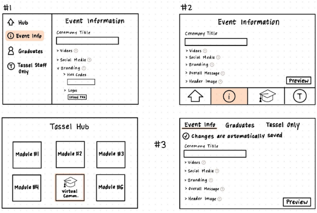
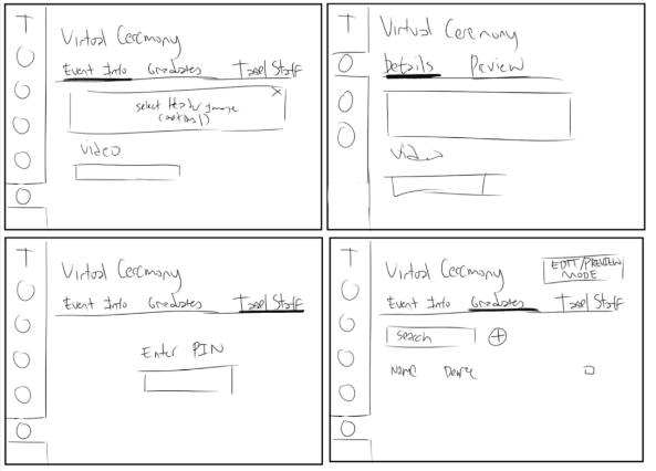
The initial ideas of Tassel's virtual ceremony portal redesign.
Each team member sketched a version the website’s UI, guided by the current web page, our research findings, and information architecture. We then met to discuss our design decisions and compare similarities across our sketches.
WIREFRAMES
Early structure of the web experience.
We then transformed and refined our ideas into wireframes, further establishing the layout of the content. My team and I uncovered a fitting layout and key features we wanted to incorporate before creating a low-fidelity prototype.

Navigation between tabs felt unclear and disorganized, with no clear distinction between areas intended for clients and those for Tassel staff.
Introducing a left-aligned navigation bar established clearer separation between user types and streamlined navigation across the platform.
1
Selection: Choose which ceremony website to build directly from the navigation bar
2
Event Tab: Allows customization of their current selected virtual ceremony page through different sections
3
Graduates Tab: Contains a graduate overview of the selected ceremony
4
Site Preview: View the current state of the website product as its developing
5
Tassel Staff: Content only for Tassel staff requiring a unique pin to access
6
Return to Hub: Access point to the Tassel Hub, a centralized place for managing and viewing graduate information
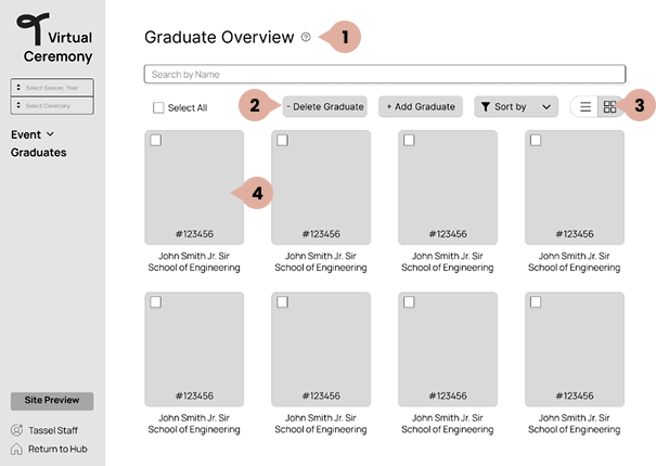
The layout of graduation information lacked structure, resulting in a cluttered and confusing overview.
Streamlining the layout for viewing and editing graduate information results in a more intuitive, user-friendly experience.
1
Help Button: Help icons provide contextual guidance throughout the interface
2
Add or Delete: Clarifying Add and Delete controls enhances user understanding and reduces potential errors
3
View Content: Enables users to alternate between list and grid views based on their preferred browsing style
4
Graduate List: Select individual graduates to access additional details
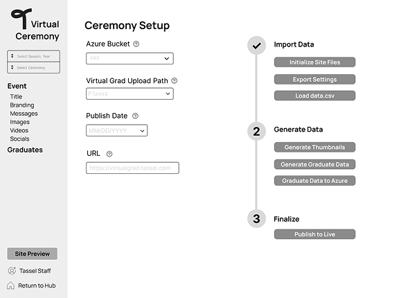
Staff-only content was not properly restricted, and the processes within this section—such as uploading materials and publishing the website—were unclear for most staff.
A dedicated, PIN-protected staff tab now houses all internal content and introduces a clearer workflow for setting up the current website product with a step-by-step process.
LOW-FIDELITY EVALUATION
Connecting with users once more.
To evaluate how effectively our low-fidelity prototype functions, we conducted usability studies with Tassel staff. We maintained the same testing protocol used during our initial usability studies in the user research phase to ensure consistency and enable direct comparisons between the original virtual ceremony platform and our redesign.
Our findings include:
Our findings include:
- Organization. Participants still struggled to determine where specific content belonged
- Context enhancement. Participants identified minor but important enhancements, such as, including asterisks to indicate required fields and implementing character counts for text inputs, in hopes of improving the user experience and reducing form completion errors
- Customizability. Participants identified the need for more customizability features to a client's website design
ITERATION
Refining and evolving the concept.
Aesthetics
One of the core findings from our research was that users felt that the virtual ceremony page did not match up to the design of Tassel’s other products. Since our virtual ceremony page was designed to be accessible through Tassel’s hub interface, our team wanted to ensure there was seamless integration when accessing those pages. We designed the virtual commencement page to match their visual design system.
.png)
Redesign of the navigation bar (1st is our design, 2nd is Tassel's design, 3rd is the combined design)
Functionalities
Based on the feedback, our team also implemented a landing page to ease users in when switching between the Tassel hub and virtual ceremony interfaces. This change allows users to track their progress and facilitates user orientation, which helps users understand the user flow of the virtual ceremony setup page.

Landing page & user completion progress
Readability
Throughout our usability tests and follow-up sessions, our users were still confused by the names of some sections, making it difficult to complete tasks. Many sections also lacked guardrail text, which led to users misunderstanding what the features actually did. With one of our design goals being clear terminology, it was important to our team that we modified the current terminology.
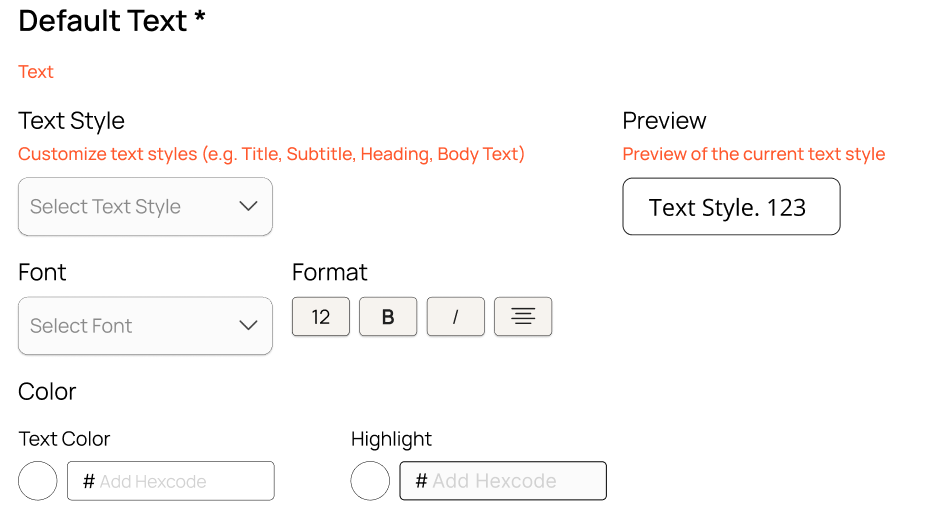


Readability of text settings
FINAL DELIVERABLE

Tassel is an all-in-one platform that works with schools to provide a smooth experience leading up to a graduation commencement. They offer an additional service for graduating students and their loved ones to celebrate their accomplishments through a digital memento: a virtual graduation ceremony. Staff and clients work together in the virtual ceremony portal, which carries essential information to set up a web page recognizing students.

Monitor Progress
Choose the ceremony web page to design and check its completion progress before continuing
Customize the Look
Colors, typography, and identity elements can be tailored to establish the site’s overall visual direction


Customize Content
Upload and manage text, images, and other assets to build the virtual commencement page
Preview the Design
A real-time preview displays how the web page will appear as updates are made


Graduate Management
Display graduate attendance and manage individual student information
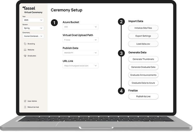
Guided Publishing
The ceremony web page can be finalized and published through step-by-step guidance
REFLECTION
Looking back on what we did.
Taking advantage of the time we were given. We began by mapping out a detailed six-month project timeline, breaking down each phase of the design process. This helped us stay organized and intentional about how we used our time. By viewing each day as an opportunity to refine our ideas, we were able to maintain momentum and continuously improve our design throughout the project.
Engaging with stakeholders. This project marked my first experience collaborating on a real-world product, where I had the opportunity to work directly with stakeholders and understand their goals, challenges, and expectations. Through regular meetings, interviews, and feedback sessions, our team learned how to balance user needs with business priorities while aligning our design decisions with the stakeholders’ vision.
Knowing our constraints. As a team, we often had to remind each other about the constraints surrounding our project. There were several moments when our ideas grew beyond what we could realistically achieve within the six-month timeline. Recognizing these limitations helped us refocus on what was most important and feasible for our final design.
Learning from my teammates. Working with Grace, Vivian, and Tinh, we all brought different skillsets to the table. Being able to learn from them helped me enhance my own skillset whether it be in project managing, researching, or designing!

.png)