.png)
Creating Wonder, A Modern Music Festival
Designing and promoting a fictional music festival
Context
During my first year in the Human-Centered Design & Engineering major, I had the opportunity to take HCDE308, Visual Communication. Over a 10-week timeframe, I designed both the functional and visual systems for a fictional festival, developing a cohesive set of promotional components that came together to form visually engaging designs.
Duration
10 weeks
My role
UX/UI Designer & Prototyper, UX Researcher
Team
Me!
Tools
Figma, WCAG
PROBLEM
"How can we design and promote a music festival through designs that are engaging and accessible to University of Washington students?"
This project began with a simple prompt: create a music festival. To design with intention, I interviewed UW students to learn about their interests, expectations, and challenges. Their insights helped shape a festival concept and promotional materials designed to be exciting and accessible for the UW community.
SOLUTION
A festival concept benefitting UW students, supported by a cohesive visual brand that is visually appealing and accessible across all promotional materials.
I designed Wonder, a multi-genre music festival tailored to the interests and needs of UW students. Drawing from insights gathered through student research, I created a cohesive visual identity that reflects the festival’s energy while remaining accessible and easy to navigate. This visual system was applied across promotional materials—such as posters, signage, and a mobile app—to ensure a consistent and compelling brand experience.
INTIAL RESEARCH
Looking at real-world music festivals.
I began by researching established music festivals to better understand how they craft engaging attendee experiences. I analyzed Slope Day (Cornell University), Hangout Fest (Alabama), and Bonnaroo (Tennessee), focusing on unique features, visual identity, and how each event communicates its offerings.


COMPETITOR ANALYSIS
Let's compare them.
To better understand how my festival could differentiate itself, I compared these festivals in a competitive analysis chart. This helped highlight common offerings, signature features, branding styles, and experience gaps that Wonder could address.
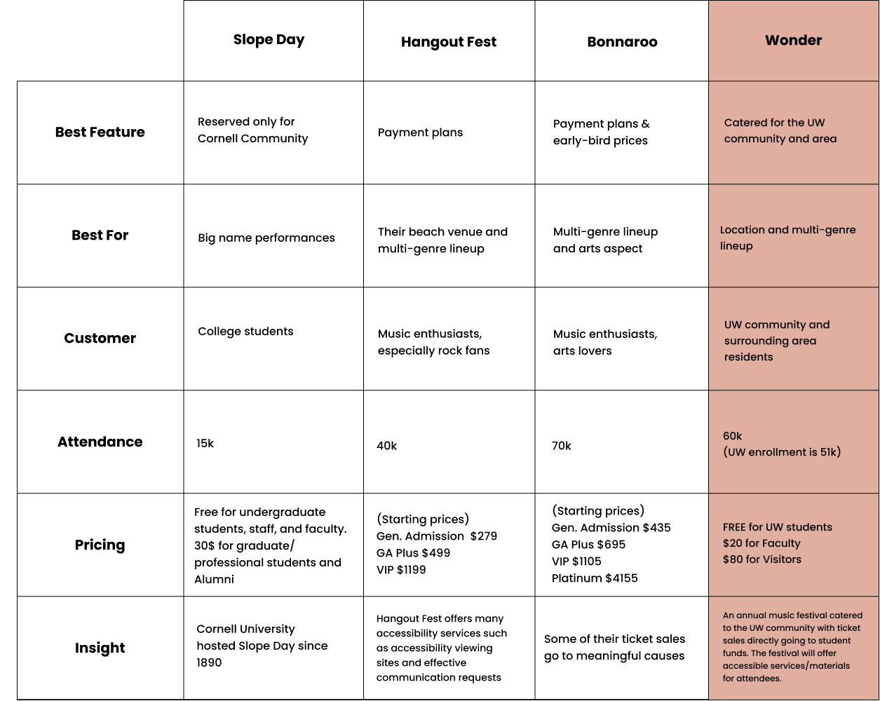
Some research points I found interesting:
- Most festivals do annual multi-day festivals
- Ticket prices did not have deals/discounts. The best were payment plans and early bird prices
- Hangout Fest offers accessibility services for festival-goers
- Cornell's Slope Day is exclusive to only Cornell University affiliates.
PERSONAS
Talking with festival-goers in the UW community.
I got into contact with 3 students who attend festivals. Engaging with them revealed their own experiences with the entire process of attending various festivals, which will help guide the design. Here are some of them questions I asked them:
- What draws you towards going to a festival?
- Tell me about a festival experience you’ve had — what did you enjoy or not enjoy about it?
- What kinds of things help you decide whether to go to a festival or skip it?
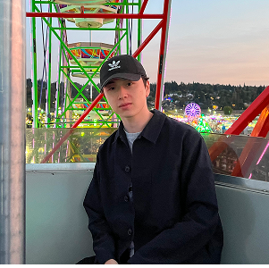
Nathan
Nathan is a passionate music fan and occasional concert-goer. Although he has limited experience with large festivals, he’s familiar with the types of activities and experiences they typically offer, providing insight into the needs of newer or more casual attendees.

Taman
Taman is a frequent festival attendee who understands the experiences, amenities, and challenges that music events offer. Her familiarity with different festivals provides insight into what attendees look for in lineups, pricing, and overall experience.
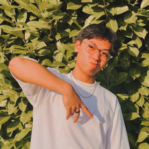
Christian
Christian is an engaged festival-goer who regularly attends live events and enjoys discovering new artists. His firsthand experience provides valuable insight into what attendees expect, from diverse lineups to on-site activities and overall atmosphere.
FINDINGS
Similar points were identified.
Conversations with Nathan, Taman, and Christian revealed overlapping perspectives around attending festivals.
- Music festivals are not in close-vicinity. Most music festivals are not located in their local area (Seattle, WA) making it a big factor in deciding to attend or not.
- Purchasing tickets is expensive and intense. Nathan, Taman, and Christian are all college students who are on a tight-budget. Ticket prices for festivals they want to go to are usually out-of-budget, discouraging them to go. Also, the process of buying tickets is difficult as they sell out quickly.
- Festivals are too crowded. When attending such events, people are in close-proximity as there is usually one or two performance locations for music artists.
- Festival lineup artist performances are too close in time. Performance times are either overlapping or too close in time to attend, especially for artists they want to see.
EVENT FEATURES
The creation of Wonder, a music festival catered to UW students.
Wonder is a annual 3 day, end-of-the-year music festival located at the University of Washington consisting of a selection of genres: alternative-rock, indie, and pop. The idea behind this is to provide a multi-day festival with popular up-and-coming artists in these genres to perform. Unlike other music festivals, Wonder provides the UW community a fun, affordable weekend through low prices and guaranteed admission as a UW student.
- Current University of Washington students will be offered free admission. Faculty price is $20 per ticket, while non UW affiliates will have to pay a fee of $80
- Ticket sales will go towards UW student funding
- 3 stages for artists to perform at
- Accessibility/information services will be offered at the venue
MOOD BOARD
Creating the visual inspiration.
I decided to create a mood board to initiate the visual design process. Ultimately, I wanted to convey a feeling of fun and groove within my festival. I thought these colors and patterns were perfect; they provide a vibrant retro feel to it, but have toned down bright colors for an additional laid back feeling.

COLORS
Defining a palette that reflects the festival’s energy and identity.
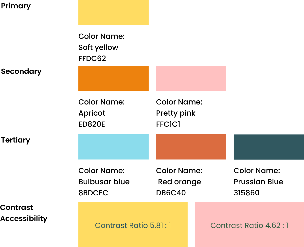
I carefully selected a color palette inspired by my mood board that also meets contrast accessibility standards, ensuring greater inclusivity in the design. Additional accent colors were incorporated to introduce visual energy and balance.
TYPOGRAPHY
Typography that amplifies the festival's spirit.
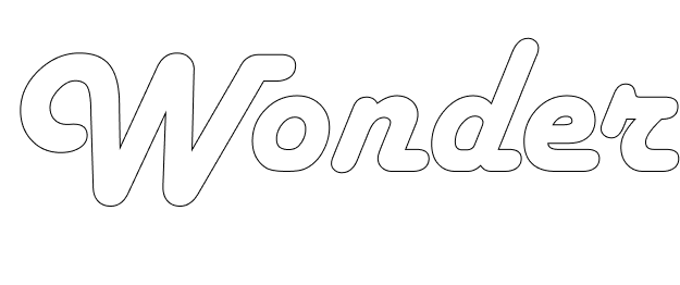
To amplify the feeling of retro and groovy, I chose to use Harlow Solid Italic as my wordmark font. Because of the already defined boldness and italicized style of Harlow Solid Italic, I gravitated towards the Fredoka font as it was unique, clean, simple, and contrasts well.

Signage in its imagined location & a comparison to a person
LOGOMARK
The visual signature of the brand.
I decided to name the festival Wonder. According to Oxford Languages, the word wonder and its definition reads, "a feeling of surprise mingled with admiration, caused by something beautiful, unexpected, unfamiliar, or inexplicable", which I wanted the attendees of Wonder to experience.
I then utilized the wordmark font and colors I chose to enhance the meaning of this word. A rainbow-like design was included as a visual representation of this feeling, symbolizing the range of artists, genres, and experiences offered at the festival. The gradient arc adds movement and excitement, reinforcing the idea of discovery and emotional uplift.
I then utilized the wordmark font and colors I chose to enhance the meaning of this word. A rainbow-like design was included as a visual representation of this feeling, symbolizing the range of artists, genres, and experiences offered at the festival. The gradient arc adds movement and excitement, reinforcing the idea of discovery and emotional uplift.
Inital Ideas


Final Design

POSTER
Communicating essential festival details through a visual communication piece.
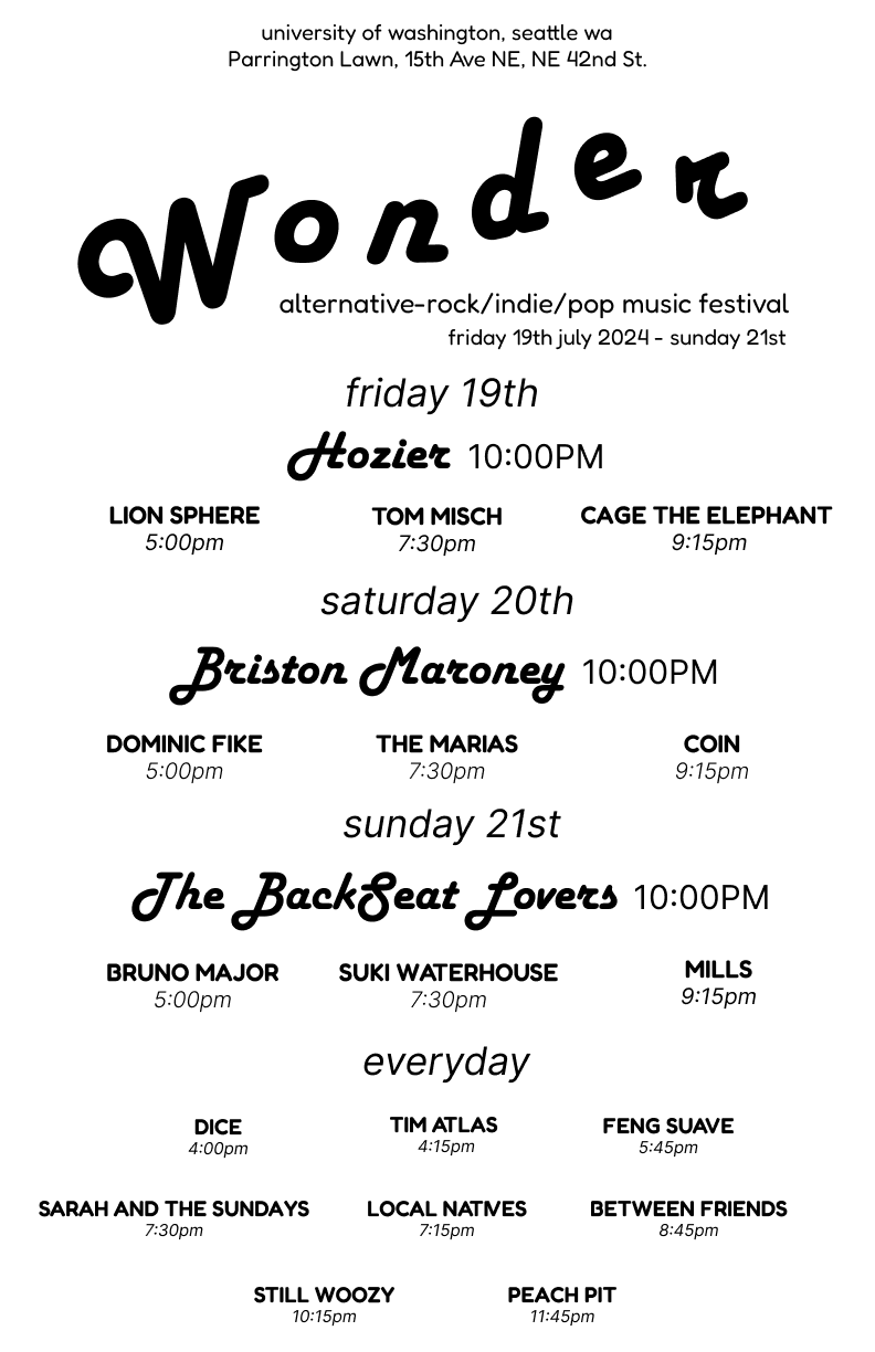
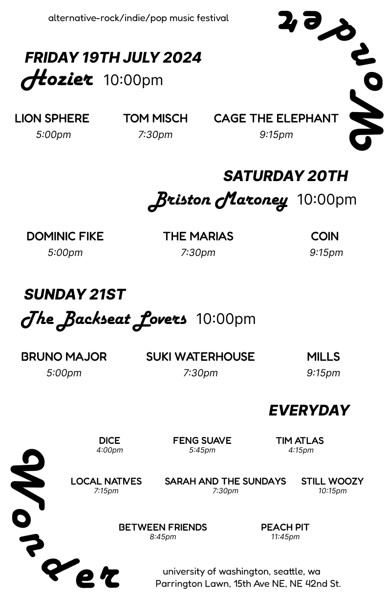
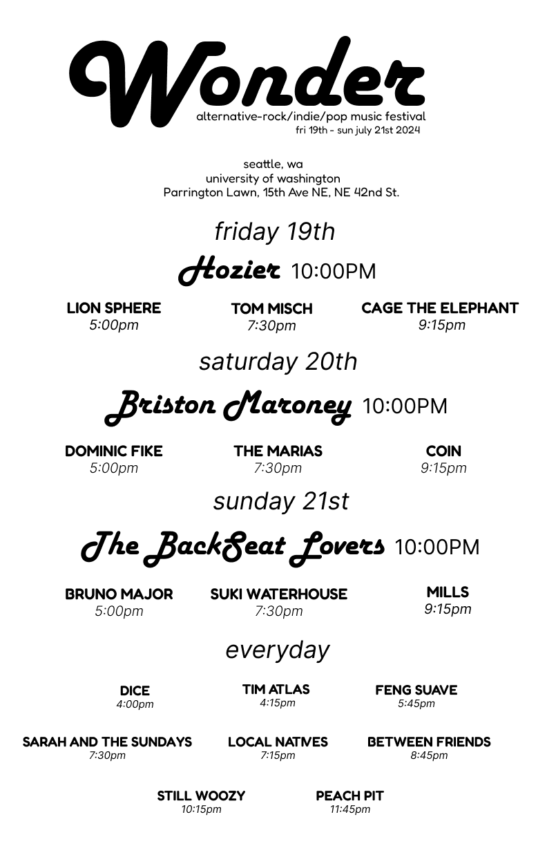
I structured the poster using clear information hierarchy. The festival name appears at the top, followed by essential details and a day-by-day breakdown of performing artists. Headliners are displayed in a distinct, larger type style to emphasize importance. To address the persona’s frustration with overlapping schedules, I assigned performance times that minimized conflict. Some artists perform across multiple days, while major acts are featured on specific dates, with the final act each day representing the biggest headliner.
Initial Design Ideas

Final Design

TICKET REDESIGN
Updating the ticket design for clarity and usability.
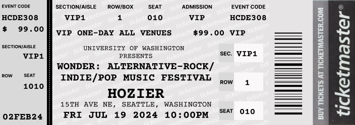
I was given a initial ticket design to recreate. Looking at the default ticket, I knew I wanted to create my ticket in a way that is matches the feel and branding to my festival, but also make it understandable to the reader. First, I wanted the ticket shape to match my wordmark, so I made the edges round. I was advised to section my information so I can fill up the white space in a way that makes sense; I did this in 3 sections, each one having relevant information for an understandable hierarchy.

FESTIVAL MAP
Improving wayfinding by organizing essential spaces into a clear visual map.
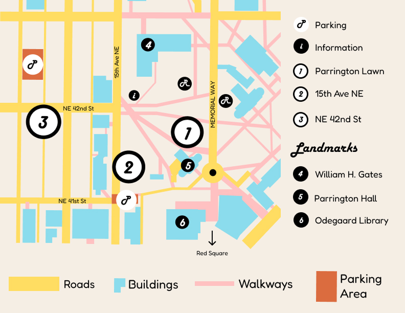
To guide attendees at Wonder, I created a map that included the essential locations for easy navigation around the venue. This included the 3 main stages highlighted by the big numbers: 1, 2, and 3. Information services, restrooms, and buildings that are relatively close to all locations for guidance is highlighted by smaller circles. Other relative information can be found on the bottom of the map.
The critique I received on my initial design was extremely helpful. My peers noted that some of the colors clashed, making certain elements difficult to distinguish. In response, I refined the palette by using more muted tones for secondary elements and reserving bolder colors for key locations, creating a clearer visual hierarchy.
The critique I received on my initial design was extremely helpful. My peers noted that some of the colors clashed, making certain elements difficult to distinguish. In response, I refined the palette by using more muted tones for secondary elements and reserving bolder colors for key locations, creating a clearer visual hierarchy.

SIGNAGE
Further improving wayfinding experience with signage
For my festival signage, I chose to do a primary, freestanding signage. I chose to do this form of signage so attendees would be guided to the stages they want to go to.

Signage in its imagined location & a comparison to a person
MOBILE APP
Extending the festival experience through a mobile app.
In addition to these physical promotion materials, I chose to create the main interfaces of a mobile app hosting the festival, its information, and ticket purchasing.
USER FLOW
Mapping core tasks to guide app interaction.
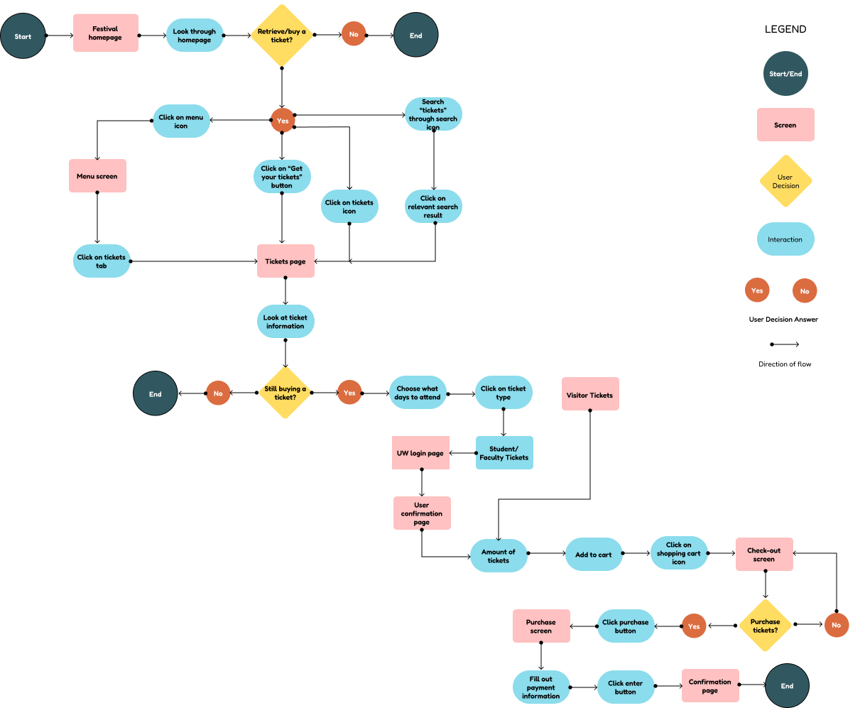
Starting the design process for the app, a user flow is necessary for the navigation of the app. I created a simple user flor that visually represents the task of buying a ticket to Wonder, showcasing the user's potential steps.
WIREFRAMES
Early structure of the app.
Transforming the user flow into a simple layout of the app, the design features a simple and intuitive interface. It also features a hamburger menu and search option for enhanced navigability.

Homepage, ticket selection, and summary & checkout wireframe interfaces
Before introducing color and visual styling, I gathered feedback from classmates on my wireframes. Some noted confusion around certain app flows, particularly how to navigate back on specific screens. These insights informed refinements to hierarchy and navigation, which were then carried forward into the polished visual designs.
FINAL APP DESIGN
The polished app experience.
.png)
Festival Homepage
Key festival information—such as dates, location, and featured artists—is highlighted for easy reference.
Ticket Selection
Ticket selection is simplified through three categories tailored for UW affiliates.
.png)
.png)
Summary & Checkout
A clear summary of selected tickets supports a smooth checkout experience.
REFLECTION
Looking back on what I did.
Learning how to use Figma. HCDE 308 was my first experience using Figma for a full design project, which meant learning both the tool and core visual design principles at the same time. While the learning curve was challenging, I found the process exciting and rewarding. Throughout the course, I explored features such as components, auto-layout, typography, color systems, and responsive structure, and grew more confident in creating cohesive layouts and reusable elements. This project ultimately strengthened my design foundation, improved my workflow, and deepened my interest in visual and product design.
Knowing the limits of visual design. Throughout this project, I often struggled to translate the design ideas I envisioned into accessible solutions. There were concepts I wanted to include, but I recognized they would not meet accessibility standards. This required me to rethink and adapt my approach, finding compromises that balanced creativity with clarity and usability. Ultimately, this process taught me to prioritize accessibility while still bringing my ideas to life in thoughtful, intentional ways.
Learning not only how to take critique, but give critique! In addition to learning visual design principles, I also gained experience giving and receiving critique throughout the quarter. Regular peer feedback sessions taught me how to communicate constructive critique in a way that was supportive and actionable, while also helping me learn to accept feedback without taking it personally. This process strengthened my ability to collaborate, iterate, and remain open to improving my work.
.png)